|
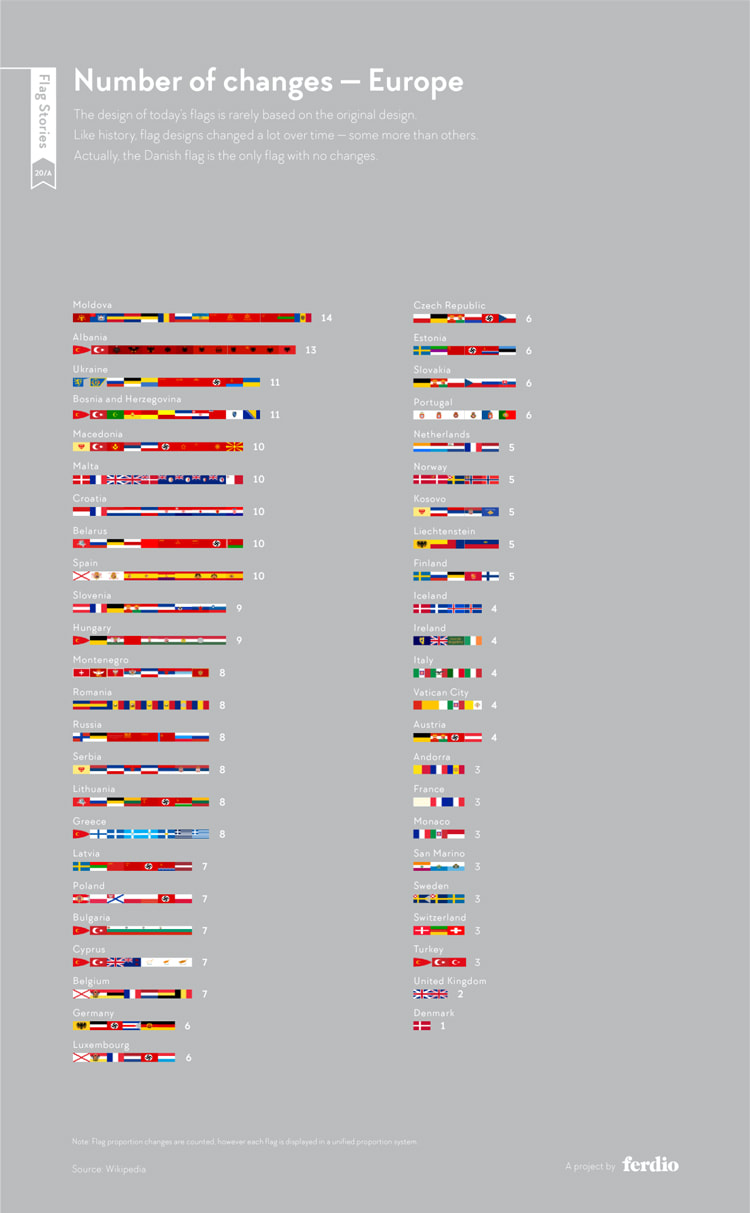
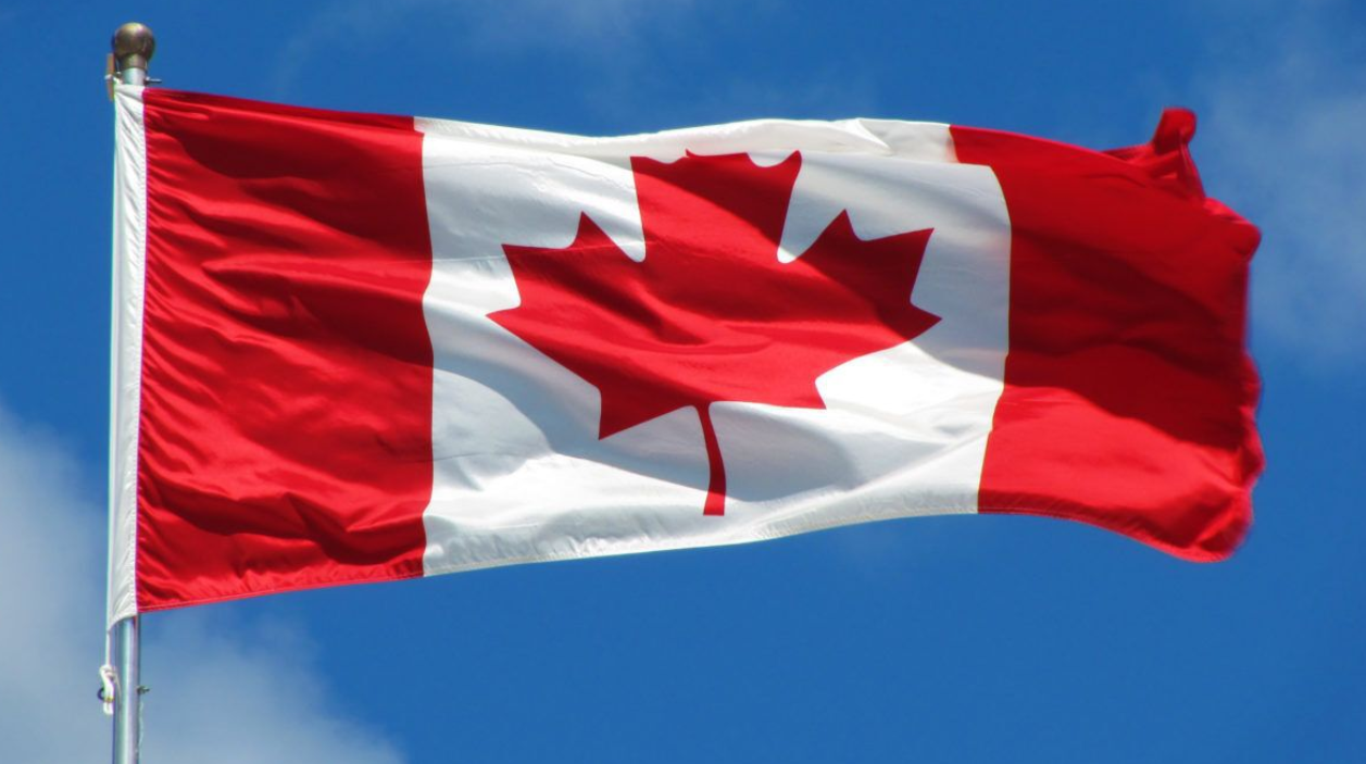
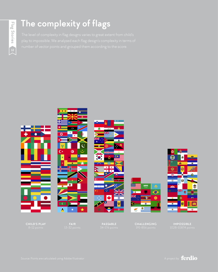
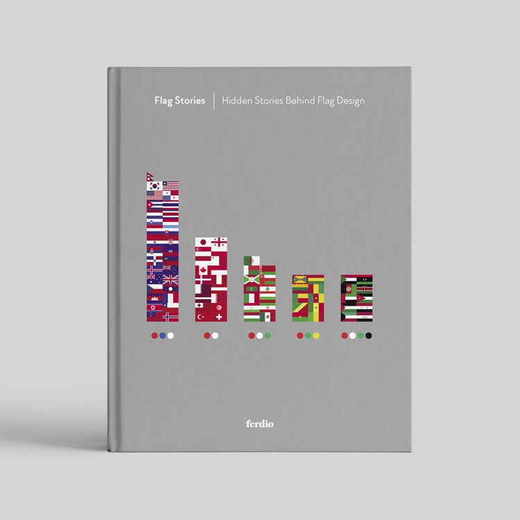
From local councils, to community organisations and whole countries, we look at past and present examples of flag redesign to explore the unique challenges of the practice. By Molly Long August 18, 2021 1:44 pm Flags are not the immutable form of graphic design they appear to be. Like logos and other brand assets, they are subject to change. As infographics design studio Ferdio showcased in its Flag Stories project, some of the world’s best-known flags are the successors of several iterations throughout history. Canada redesigned its flag seven times before settling on its current maple leaf design for example. Italy’s tricolour has been redeveloped four times. There are several reasons as to why a flag might get redesigned – some redesigns are more drastic than others. Like any traditional branding project, redesigning a flag poses a unique set of challenges. These are often distinct from designing something from scratch. But what exactly goes into the process? Ferdio infographic on the number of flag changes in European countries “A cultural shift requires a more community-focused redesign process” According to vexillologist Philip Tibbetts, the first step towards actually redesigning a flag is establishing a mandate for doing so. Flags form a complex part of our identities, on personal, local and international levels, and changing them can be a big deal. Tibbetts says there are two main circumstances under which groups of people will accept a flag redesign. The first is constitutional change. The South African flag is a good example of this, he says. Adopted in 1994 after the eradication of apartheid in the country, Tibbetts says the South African flag successfully managed to bring forward the symbolism of the old flag, but in a completely new design. The second circumstance is cultural change, which Tibbetts says is rarer. “A cultural shift requires a more community-focused redesign process,” he says, but this means it’s near-on impossible to please everyone involved. An example of this going right is the Pride “Progress” flag, designed by Daniel Quasar in 2018. While this is an example of making a flag more complex, which is usually a bad thing in flag design, Tibbetts says because the community was behind the change, it was welcomed largely with open arms. Post-1965 Canadian flag “It’s almost puzzling that this is something we all agree on” All this being said, Tibbetts says that particularly good design has in the past compensated for a lack of mandate. The aforementioned Canadian flag usurped a British ensign flag, a remnant from the British Empire. In the 1960s, the government decided a new flag was needed – this was “somewhat controversial” at the time, Tibbetts says. “I think a lot of the reason behind the success and the uptake of the maple leaf comes down to how well vexillographically it was designed,” he says. While the Canadian flag is unique with its maple leaf design, the fact it is still uses three vertical stripes puts in among a host of other nation flags. Ferdio creative director Jeppe Morgenstjerne says the recurring flag traditions around the world was the stand-out finding from the studio’s Flag Stories project. “It was so interesting to us that even though the world’s flags have all been designed and adopted at different points in history and places, so many of them follow these implicit rules,” he says. There are patterns when it comes to size, colour, proportions, shapes and layouts, Morgenstjerne adds. “It’s almost puzzling that this is something we all agree on.” Ferdio infographic on the complexity of flags “It’s the community itself who will adopt the design” Those looking to redesign a flag have the choice of opting for one of these tried-and-tested formats, or something completely new. Either way, both Morgenstjerne and Tibbetts say the most successful flags are often the simplest. “Whether or not a child can draw it from memory is usually a sign of a good flag,” says Morgenstjerne. This quality is actually the subject of another of Ferdio’s Flag Stories infographics, which ranks the world’s flags on a scale of “child’s play” to “impossible”. Flags like Japan’s – known in the country as the Hinomaru – and France’s Tricolore are rated the easiest. Whereas flags like Iran’s and Argentina’s are considered the hardest to draw. The UK’s Union Jack comes somewhere in the middle. Tibbetts, who helps communities around the UK design their own flags, admits that the actual creative part of each project is only the first step. Like any good rebrand, redesigning a flag means considering applications and assets. “It’s the community itself who will be the ones to adopt the design and spread its use widely,” he says. Kyle Lockwood’s Silver Fern Flag “Sometimes oversimplification means the design won’t resonate” But as one might be able to guess, finding a flag design that a whole community can get behind it challenging to say the least. “The design must resonate with the people it is intended for, [which is] quite a difficult task,” says Kyle Lockwood, whose Silver Fern flag design was put to a public referendum in New Zealand in 2016. Lockwood’s flag was the most successful out of a group of potential successors to the country’s British ensign flag. He said its design, which features a silver fern leaf, represents “Aotearoa’s [the Indigenous word for the country] peaceful, multicultural society, a single fern spreading upwards represents one people, growing onward into the future”. New Zealand’s flag referendum has been one of the most high-profile flag redesign stories of recent years, and showcases the difficulty involved in the process. “[Because] it was put to a popular vote, there were more than four million different opinions on the design,” Lockwood says. He says one of the biggest challenges was figuring out which rules to follow and which to break. The Silver Fern flag, for example, is not so simple that a child could draw it from memory as Morgenstjerne suggests. “Rules are made to be broken,” says Lockwood. On the subject of a flag that is “child’s play” to draw, he adds: “Sometimes oversimplification means the design won’t resonate with the people it is supposed to represent.” Ferdio’s prospective book containing findings from the Flag Stories project, which the team are currently seeking a publisher for “I thought the whole thing would die down” In the end the Silver Fern Flag recieved around 44%, it may not have been voted in as Lockwood had hoped, with the New Zealand electorate opting to stay with its current flag, but he says the Silver Fern Flag has not died. As Tibbetts mentions, the success of a flag ultimately comes down to a community’s willingness to spread the message. Lockwood says this has happened. Silver Fern Flag and Indian Flag at a New Zealand cricket match in January 2020 “I thought the whole thing would die down a few weeks after the second referendum, however, many Kiwis have continued to embrace it,” he says, explaining the Silver Fern is often waved at sporting events. Six years later, and the flag is still available online, he says. “The biggest demand of late has been, you guessed it, face masks,” Lockwood ends. Feature | Design Week UK
https://www.designweek.co.uk/issues/16-22-august-2021/unfurling-the-secrets-of-flag-redesign/
0 Comments
Your comment will be posted after it is approved.
Leave a Reply. |
MEDIAArchives
December 2022
Categories
All
|




 RSS Feed
